We have to admit that being an open source platform , used by so many manufactures on so many different devices is not exactly an advantage for Android, when we talk about application development with supporting multiple screen sizes. But this is nothing new. There is an article on the Android.com, discussing a few programming tips, in “Supporting multiple Screens”.
Besides the multitude of screen densities, that can be handled satisfactory by using the DPI approach, there are also very big differences in screen resolutions, especially when comparing phones with tablets.
Creating a separate layout xml file might be a painful experience, not to mention that that are times when we simply want to scale the same interface, to maintain its look and consistency when running on a phone, but also when running on a tablet. So, here is the question:
How to scale an Android User Interface on multiple screens?
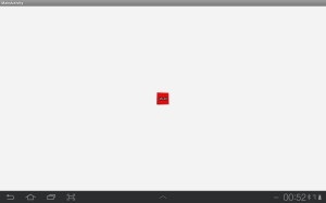
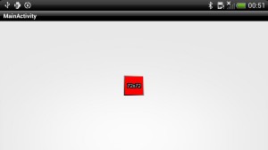
Let’s start with an example: two android devices, a tablet (MDPI, 1280×800 pixels) and a phone (HDPI, 960×540). The sample code shows an image, centered on the screen. The image is provided in res/drawable-mdpi and res/drawable-hdpi. Here are the two variants:
![]()

The tablet picks up the 48×48 one, and the phone the 72×72 one, as expected, based on their DPIs. The code to draw the image is simple:
 public void onCreate(Bundle savedInstanceState) {
        super.onCreate(savedInstanceState);

        RelativeLayout panel = new RelativeLayout(this);
        setContentView(panel);

        ImageView iv = new ImageView(this);
        iv.setImageResource(R.drawable.scaletest);
        RelativeLayout.LayoutParams lpv = new RelativeLayout.LayoutParams(LayoutParams.WRAP_CONTENT, LayoutParams.WRAP_CONTENT);
        lpv.addRule(RelativeLayout.CENTER_IN_PARENT);
        panel.addView(iv, lpv);

    }
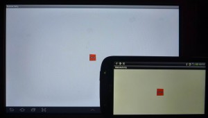
Here are screen captures showing the result, and a real photo. The real photo shows that the DPI is correctly taken into account, and the image appears of having the same size on these different density screens:
Now let’s assume we are designing a single interface layout in Photoshop: we place some given size buttons, some given size images, and all in one, the entire interface is designed to fit a certain aspect ratio. How can we have that fit into the two screens used as examples above?
Well, for a start, if we go for full sized/no titlebar and no statusbar option:
requestWindowFeature(Window.FEATURE_NO_TITLE);
getWindow().setFlags(WindowManager.LayoutParams.FLAG_FULLSCREEN,WindowManager.LayoutParams.FLAG_FULLSCREEN);
then the tablet has (in landscape mode) a screen ratio of 1280/752=80:47 (because the bottom tablet bar also uses space, out of the total 1280×800 screen size) while the phone has 960/540=16:9. Both interfaces should be on landscape, so if we design our interface layout to be of 960×640 pixels, we’ll need to scale the height (640) to match the tablet’s screen height, and so for the phone’s screen height. Using this scaling factor, we then resize the width as well, and our interface designed for 960:640 will get: 1128×752 (scale factor 1.175, padding horizontal: 76pixels) on the tablet, and 810×540 (scale factor 0.84375. padding horizontal: 75pixels):


So what we can do at this step is design the entire interface to match 960×640 pixels, then put all images in drawable-nodpi (so we always get constant size bitmaps), and scale everything on screen according to our scaling factor, m_fFrameS:
@Override public void onCreate(Bundle savedInstanceState) {
        super.onCreate(savedInstanceState);

        requestWindowFeature(Window.FEATURE_NO_TITLE);
        getWindow().setFlags(WindowManager.LayoutParams.FLAG_FULLSCREEN,WindowManager.LayoutParams.FLAG_FULLSCREEN);

        RelativeLayout panel = new RelativeLayout(this);
        setContentView(panel);

        /*ImageView iv = new ImageView(this);
        iv.setImageResource(R.drawable.scaletest);
        RelativeLayout.LayoutParams lpv = new RelativeLayout.LayoutParams(LayoutParams.WRAP_CONTENT, LayoutParams.WRAP_CONTENT);
        lpv.addRule(RelativeLayout.CENTER_IN_PARENT);
        panel.addView(iv, lpv);*/

        DisplayMetrics dm = new DisplayMetrics();
		getWindowManager().getDefaultDisplay().getMetrics(dm);
		int m_nTotalW = dm.widthPixels;
		int  m_nTotalH = dm.heightPixels;
		// scale factor
		float m_fFrameS = (float)m_nTotalH / 640.0f;
		// compute our frame
		int m_nFrameW = (int) (960.0f * m_fFrameS);
		int m_nFrameH = m_nTotalH;
		// compute padding for our frame inside the total screen size

		int m_nPaddingY = 0;
		int m_nPaddingX = (m_nTotalW - m_nFrameW) / 2;

        Log.d("ScaleTest", "Total:"+m_nTotalW + "x"+m_nTotalH+ " Scale:"+m_fFrameS+" Frame:"+m_nFrameW+"x"+m_nFrameH + " Padding:"+m_nPaddingX+"x"+m_nPaddingY);

        RelativeLayout frame = new RelativeLayout(this);
        frame.setBackgroundColor(Color.GRAY);
        RelativeLayout.LayoutParams lpv = new RelativeLayout.LayoutParams(m_nFrameW, m_nFrameH);
        lpv.leftMargin = m_nPaddingX ;
        lpv.topMargin = m_nPaddingY;
        panel.addView(frame, lpv);
    }
Scaling method 1: scaling the drawables
As you can see , we are more interested in preserving our interface’s coordinates, and graphical elements intact, then of actually having our buttons have the exact length in centimeters between various devices (not really important). To continue, let’s use another example, where we design a complete 960×640 user interface (the floral brown background), and we have one single imageview (the purple flower), placed at some exact coordinates. We want this interface to be drawn exactly the same way, when running the code on various devices:


The coordinates for the imageview are given by the cyan guidelines. We save the two images (background, flower) in /res/drawable-nodpi . To load them we use:
public Bitmap getScaledBitmap(Context context, float scalex, float scaley, int id) {
	Bitmap bitmap = BitmapFactory.decodeResource(context.getResources(), id);
	Matrix matrix = new Matrix();
	matrix.postScale(scalex, scaley);
	matrix.postRotate(0);
	Bitmap scaled =  Bitmap.createBitmap(bitmap, 0, 0, bitmap.getWidth(), bitmap.getHeight(), matrix, true);
	bitmap.recycle();
	return scaled;
}

public Drawable getScaledDrawable(Context context, float scalex, float scaley, int id) {
	return new BitmapDrawable(context.getResources(), getScaledBitmap(context, scalex, scaley, id));
}
And then the code to display the background and the image is:
       frame.setBackgroundDrawable(getResources().getDrawable(R.drawable.background_ui_android));

        ImageView iv = new ImageView(this);
        iv.setImageDrawable(getScaledDrawable(this,
        		m_fFrameS, m_fFrameS, // same scaling factor on horizontal and on vertical
        		R.drawable.flower_ui));
        lpv = new RelativeLayout.LayoutParams(
        		Scale(231,m_fFrameS), Scale(192, m_fFrameS));
        lpv.leftMargin =  Scale(410,m_fFrameS);
        lpv.topMargin = Scale(239,m_fFrameS);
        frame.addView(iv, lpv);
And here is the result: tablet vs phone:


As you can see, the images are perfectly scaled, aspect ratio matched, on two different android devices.
Sample code available here: ScalingTest_1
Scaling method 2: scaling the Views
The first approach was to scale the drawables we feed to the views. Let’s try instead, to create custom views of exactly the same we provide, while their content scales automatically. We’ll be needing a custom ImageView, so we’ll just extend the class.
The trick is to override the onMeasure method:
public class ScalableImageView extends ImageView {
	int m_w, m_h;

	public ScalableImageView(Context context, int w, int h) {
		super(context);
		m_w = w; m_h = h;
	}
	@Override
	protected void onMeasure(int widthMeasureSpec, int heightMeasureSpec){
		super.onMeasure(widthMeasureSpec, heightMeasureSpec);
		this.setMeasuredDimension(m_w, m_h);
	}
}
And the result is very much the same, but without having to allocate memory for the scaled drawable, as in example 1:


The code: ScalingTest_2

Thanks for your post. FYI the same post from my blog about image scaling